What would You do?
Sustainable Development Goal - Children’s Game
Studies show that nearly 50% of children coming from ethnic minority households are amongst the highest rate of poverty within the UK.
A game based on the Sustainable Development Goal (SDG) 10. Reduced Inequalities.
Targeted audience: 8-10 year olds.
Centred around encouraging children to confidently make positive choices to help people; fostering inclusivity, in turn, reducing inequalities.
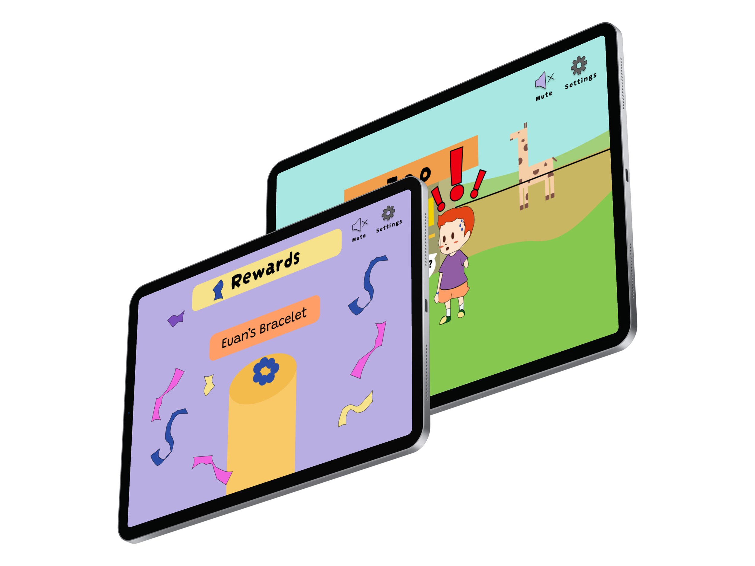
Includes animated scenarios, multiple choice and rewards schemes. Motivating children to build the skills to nurture one another.
Project Overview
Research
Competitor Analysis
Target Audience & Design

Design Process
I conducted a competitor analysis and noticed Reducing Inequalities had not been explored. I played a few games on this topic. The user journey helped me evaluate visual aesthetic, information architecture and character design. Sparking inspiration for my own design decisions and strategy.I critically researched my target audience, focusing on social emotional development, inclusivity and accessibility. Exploring design research highlighting how inequalities at an early age impact learning and development.Ideation
Choosing a SDG
Why SDG 10?
I quizzed myself on my values, through the process of elimination, SDG 10 was settled upon.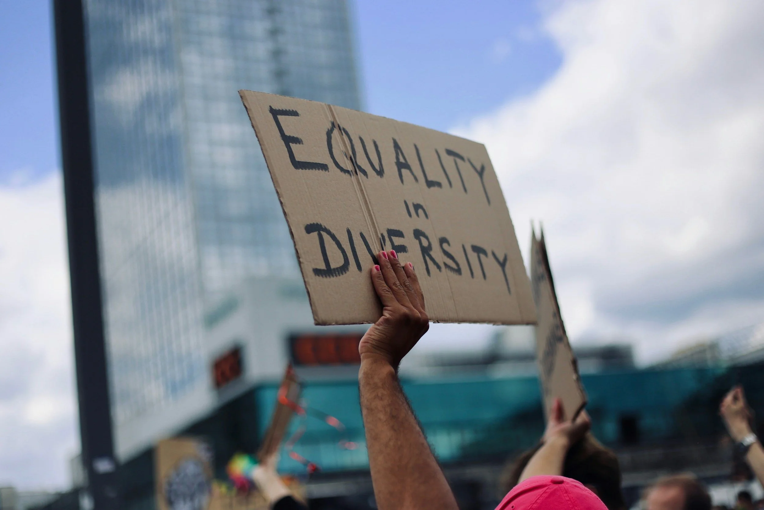
Ensure equal opportunities whilst inclusion will allow for the conditions, allowing equality to be possible.

Inclusivity nurtures and builds positive choices for great foundations for equality. Inspiring people to collaborate towards a safer, healthier and more friendly world - together.
Development
User Discovery
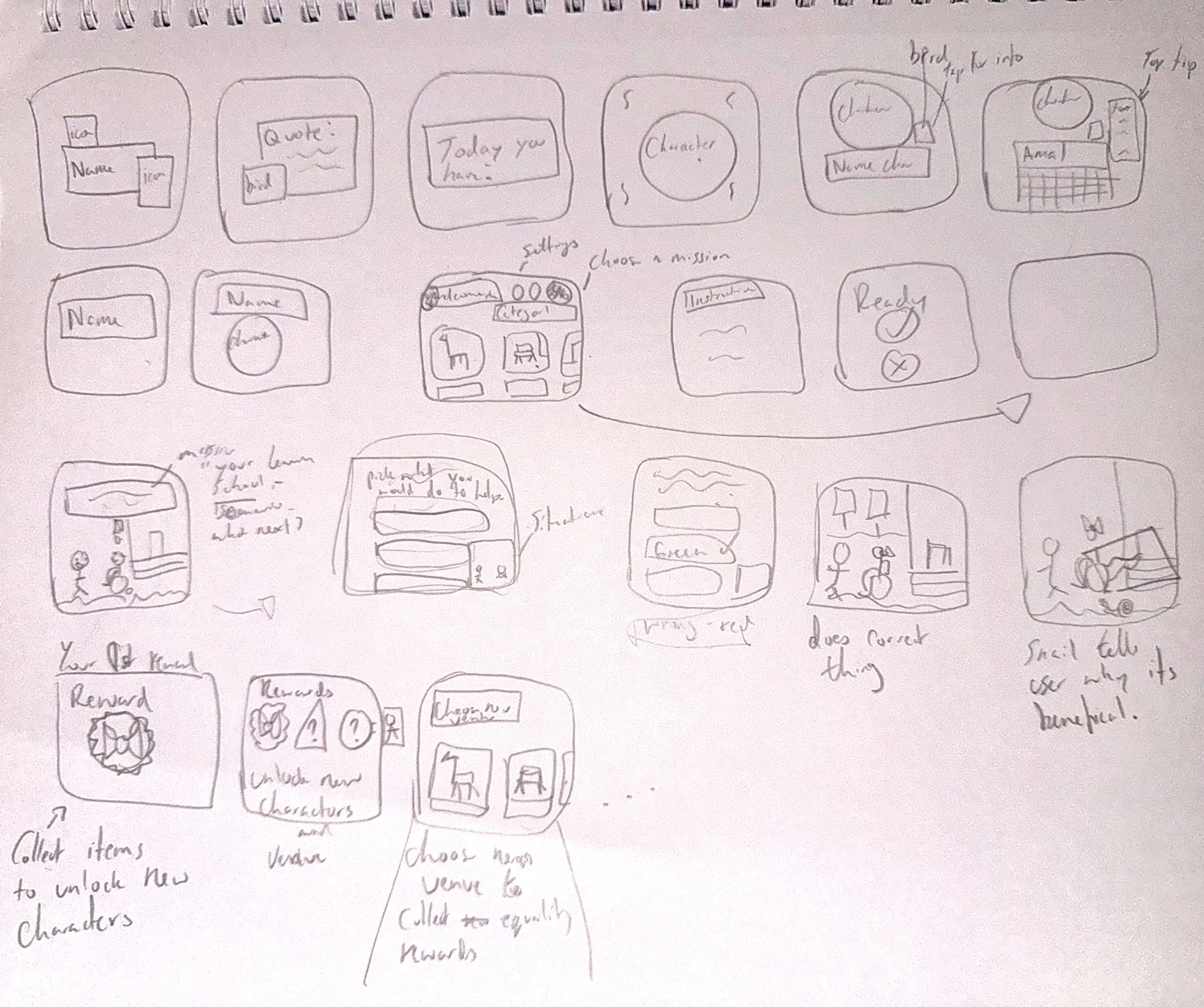
Sketches
Wireframes
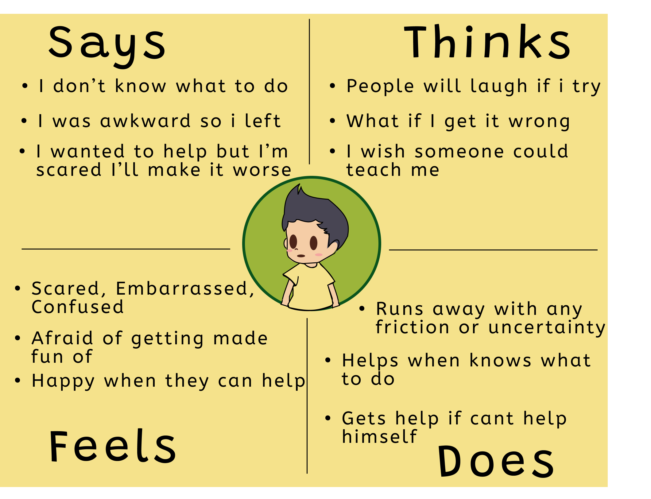
I defined users backgrounds, by doing user stories, personas, empathy maps, etc,.
This process allowed me to empathise. Identifying key needs to make user-centric design meaningful.
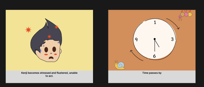
I sketched a story board to visually a real-world scenarios of how a user would engage with my app. This defined long term value. see what type of situation would lead to my user needing
I also developed and iterated a site map, structuring the game experience, identifying pain points and ways to enhance intuitive navigation and user flow.
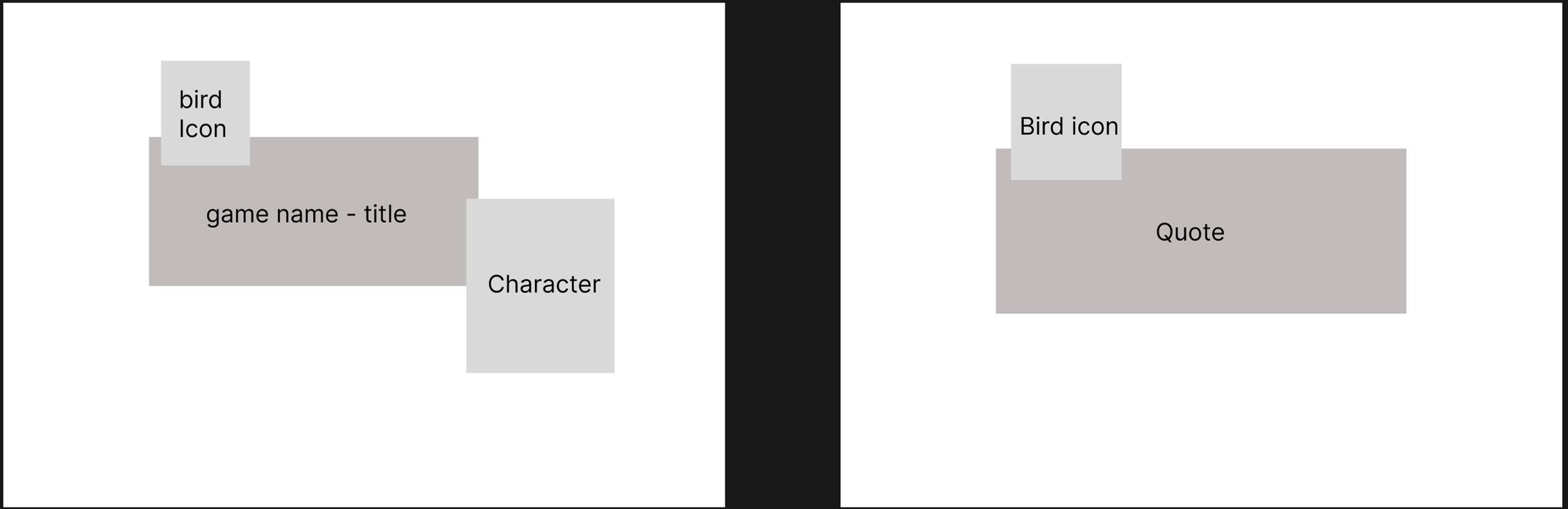
Lo-fi wireframes revealed navigation issues, leading to purposeful layout and placement of main features.
Hi-fi wireframes highlighted weak areas that needed refined, ensuring alignment when transitioning and consistent brand identity.
Overall this process of wireframes revealed minor flaws, leading to correction for smooth user experience and transitions.
Mini Brand Guidelines
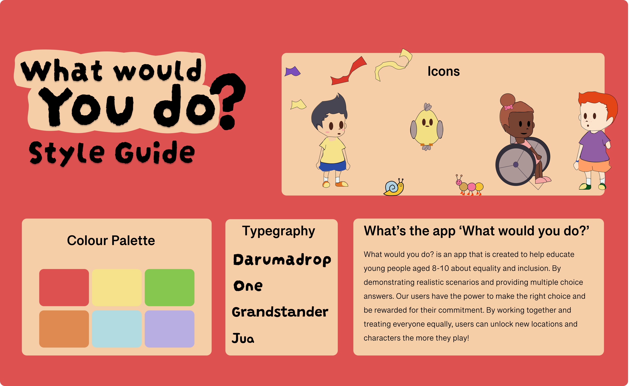
A deliverable, also helpful for knowing the boundaries our the design so if I revisit I can seamlessly continue on, knowing main colours, type, icons used and the core purpose of the app.
Brand Identity
I established and maintained brand personality throughout: friendly language, familiar settings, accessible and colourful palette used. Always going back to the purpose of project and meeting the set goals.
Testing & Feedback
Feedback
My lecturer posed that animated scenes within the app would be good, so I did that. My peers gave feedback and I iterated as I seen the benefit of doing so. Creating more fluidity between screens.
Once submitted, I had great feedback although I was advised to work on my finesse with transition times.
Reflection
Pro’s and Con’s from my perspective
This project positively challenged my creative skills. The project was intimidating at first, however I now am more skilled in design and have more confidence in designing. I loved applying my research to my designs and the journey of how I created an effective app design with purpose. This project highlighted the importance of interaction and refinement. If I were to do this project again, I would spend more time on testing more ideas at an earlier phase in the design process to strengthen my brand roll-out and user experience.
Explore my project in more depth