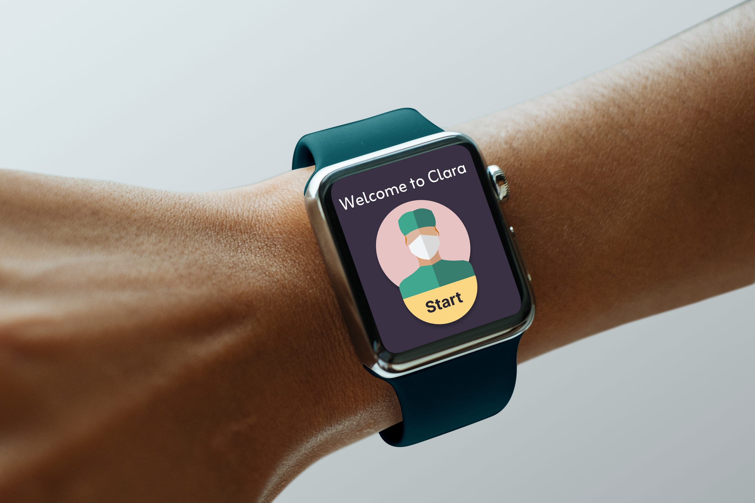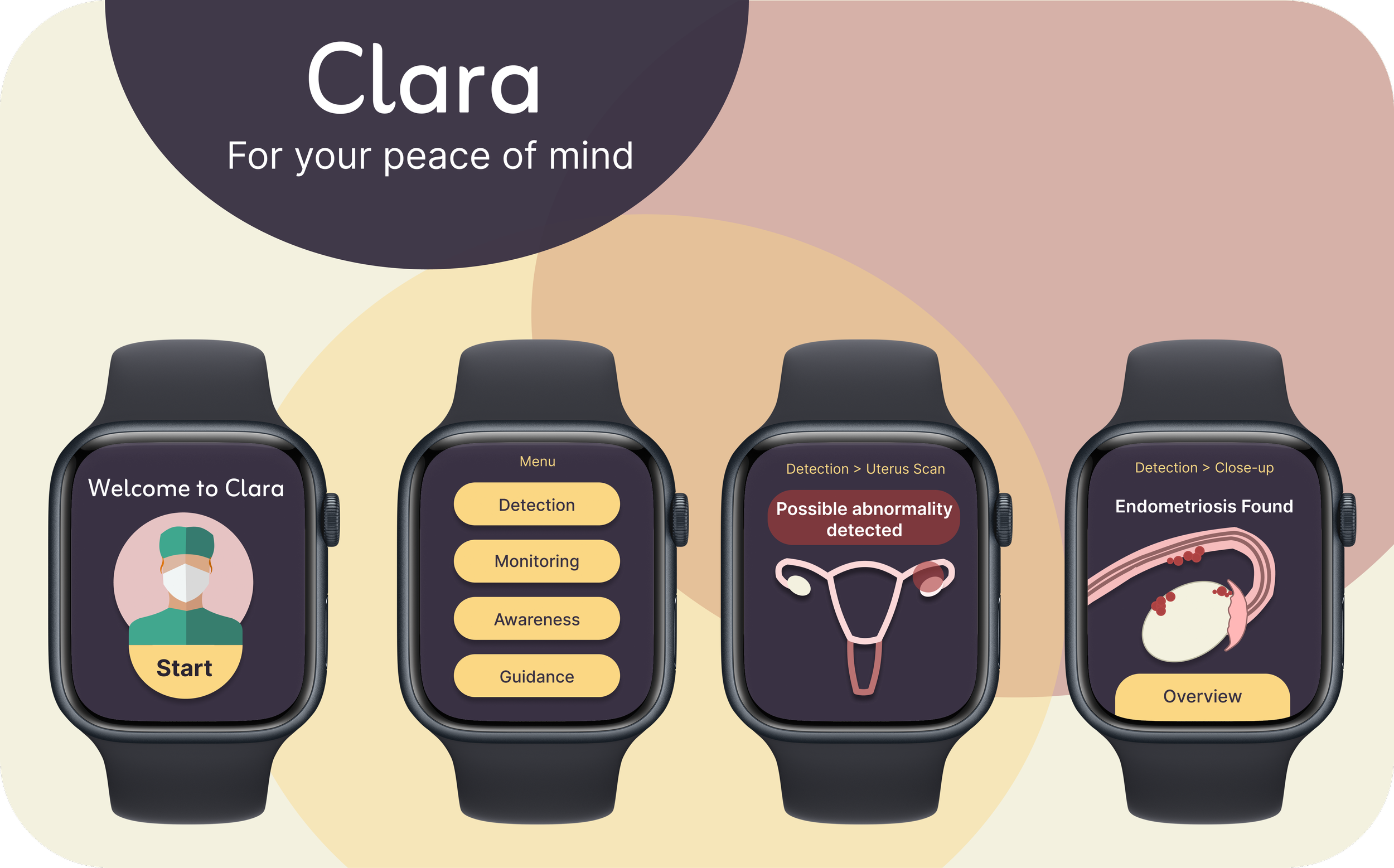
Clara
Specular Smartwatch Design
Project Overview
Only 2% of medical research funding is allocated to pregnancy, childbirth, and female reproductive health. Despite 1/3 women reporting related health issues.
Research highlights a significant gap in research and accessible healthcare support for women.
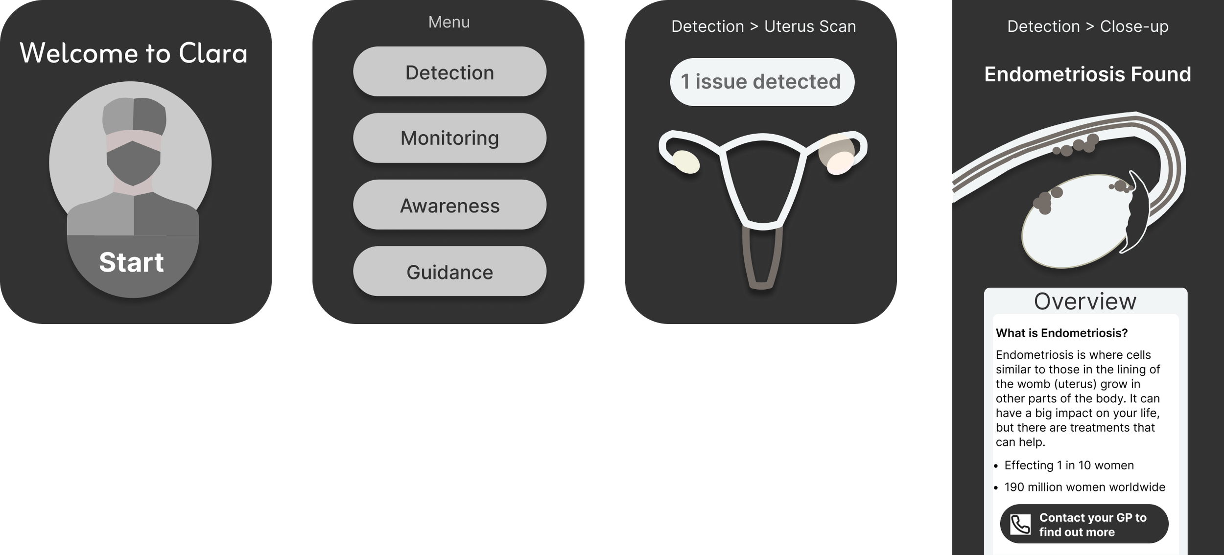
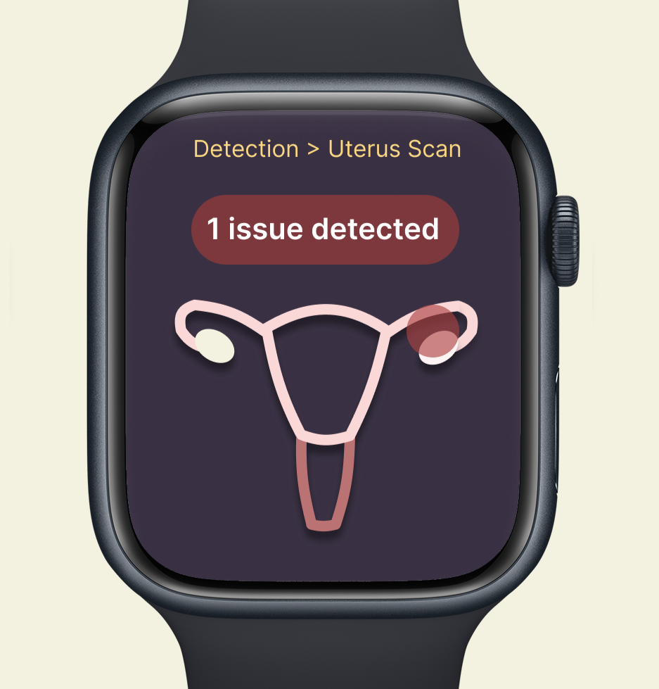
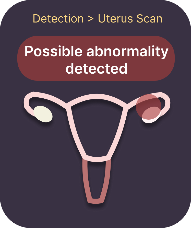
Clara is designed to revolutionise women’s health by addressing this gap. Empowering users with instant access to their reproductive health data.
Providing live uterine scans and health insights, detecting possible abnormalities such as: cysts, endometriosis, etc.
Early visibility enables users to take control of their health and improving future outcomes. Providing evidence to healthcare professionals ensuring users are taken seriously and acted upon.
Design Process
Research
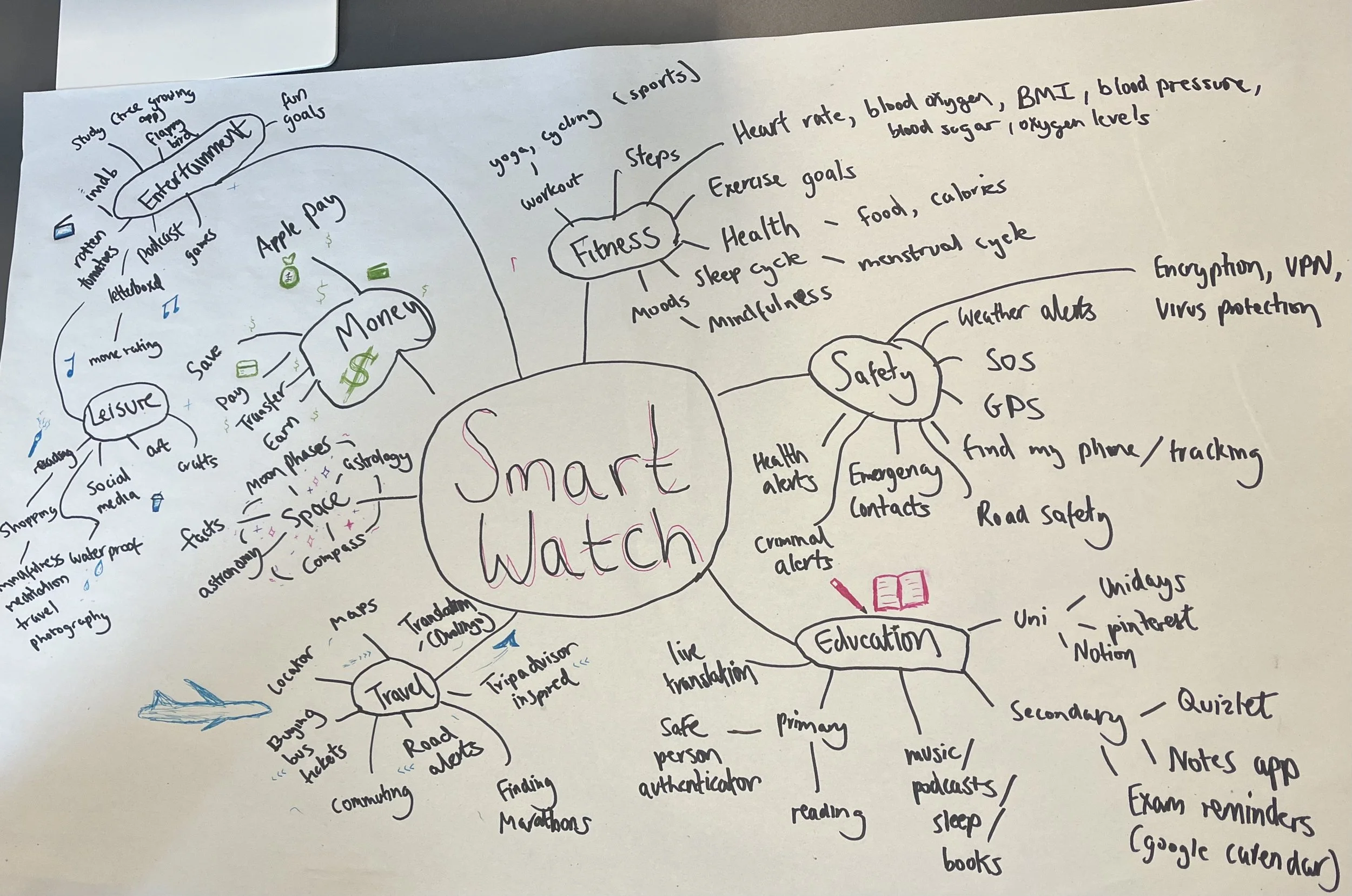
Mind Map
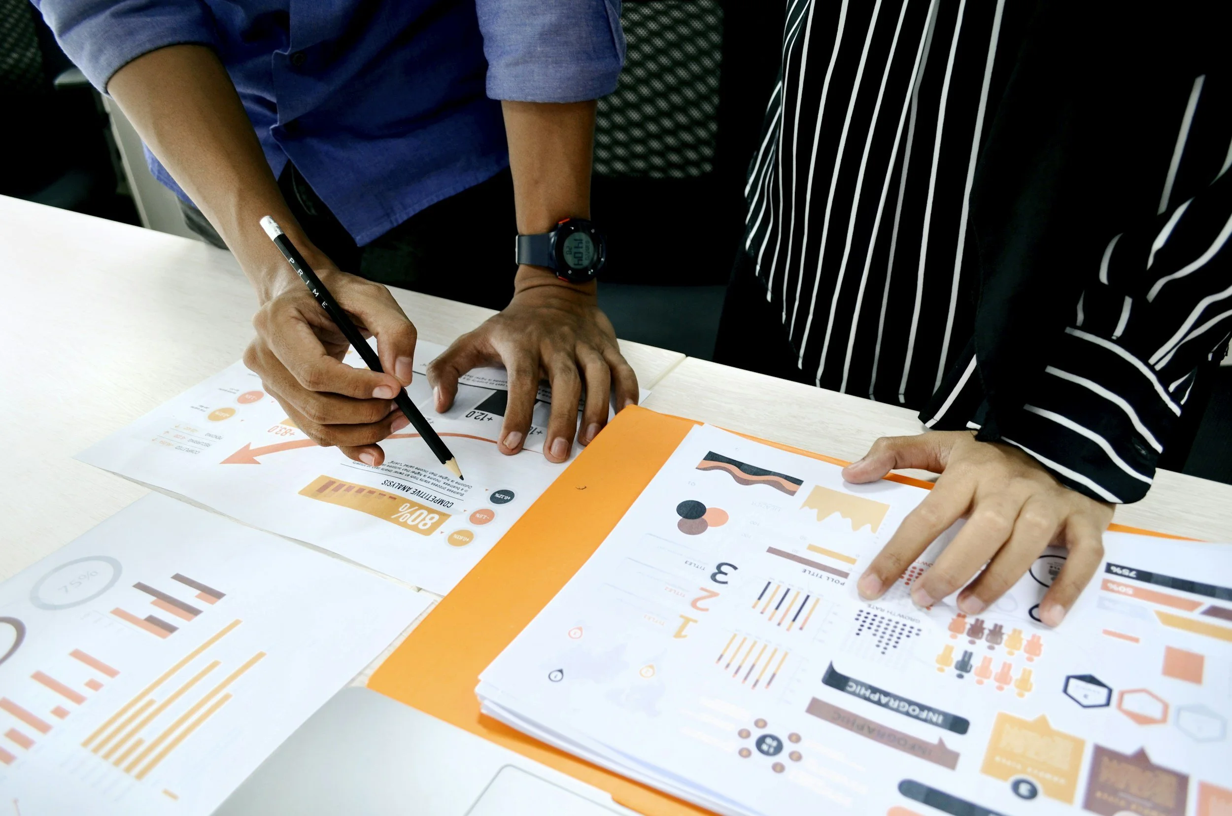
Competitor Analysis
Colour Palette
Mind Mapping supported my discovery phase by stemming relationships between topics, user needs, challenges and features. This challenges my initial ideas, inspiring me to think big, within a range of sub-categories leading me to defining phase.By conducting a competitor analysis, I discovered the most common types of smartwatches and their features. I utilised my finding, deciding on a healthcare based smartwatch.
I further conducted a survey, to collect qualitative and quantitive data based on health smartwatches. Surveying women aged between 18-60. Collecting data to understand what is most desired for women of various demographics.
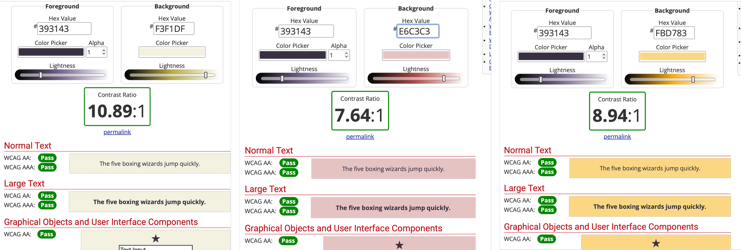
Achieving research-led decisions, choosing suitable colours that met the goals of my project.

Muted colour palette, to counteract heavy data that may be found. Give a warm, pleasant approach.

Meeting the WCAG accessibility guidelines, accessible for all users.
Ideation
User Discovery
Sketching
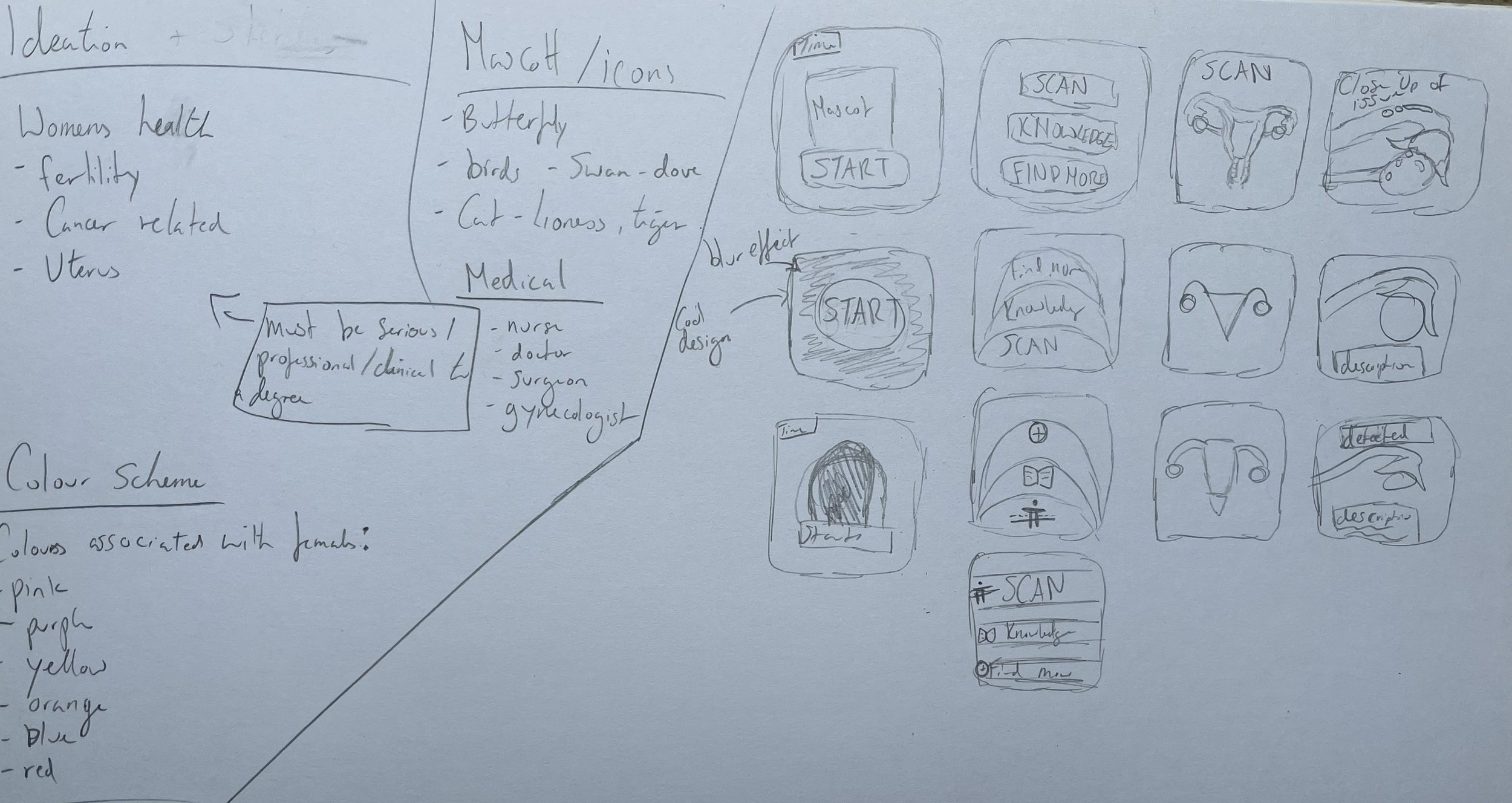
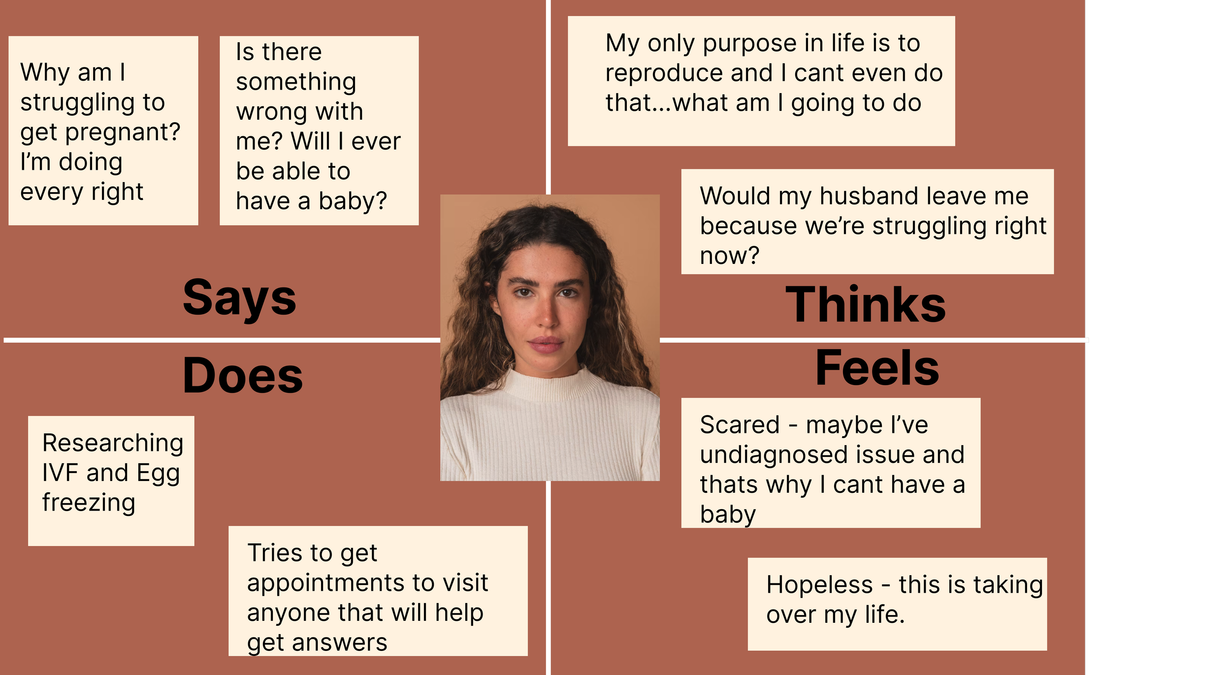
I explored 3 main user demographics, developing user stories, user personas and empathy maps which highlighted behaviours, needs and critical emotional insights. This led informed decisions for my design ensuring empathetic and intuitive approach. Sketching wireframes initiated layout decisions, feature placements and highlighted constraints of my smartwatch. I investigated a few frameworks for exploration purposes.
Wireframes
Lo-fi Wireframes
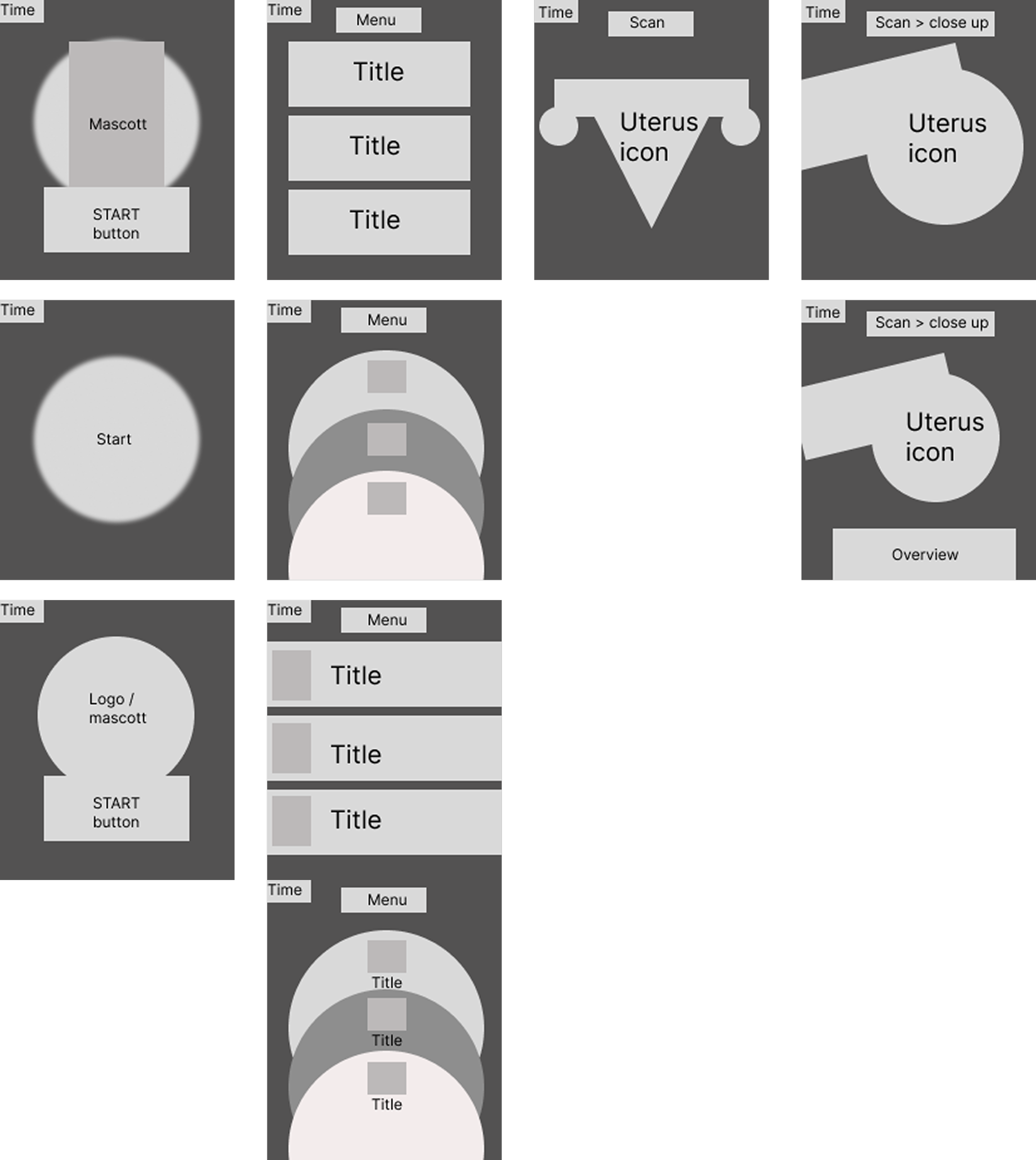
I designed lo-fi wireframes to visualise which was most effective for my theme and navigation system. Hi-fi Wireframes
I had chosen the most appropriate navigation and layout system so users can easily navigate the UI. Making hi-fi wireframes before finalising my design before prototyping. Feedback and Iterations
Feedback and Changes Made
During testing, user feedback suggested that the language could be perceived as harsh. In response , I iterated and refined my language to project a professional, more reassuring tone. Reducing potential anxiety in users, ensuring a more supportive user experience. Design Decisions
Iconography

I predominantly used circular forms of icons as this conveys a wholeness, continuity and gentle aesthetic - reassuring users. Supporting the sensitive topic, making the design softer without compromising on effective ui design. Mini Brand Guidelines
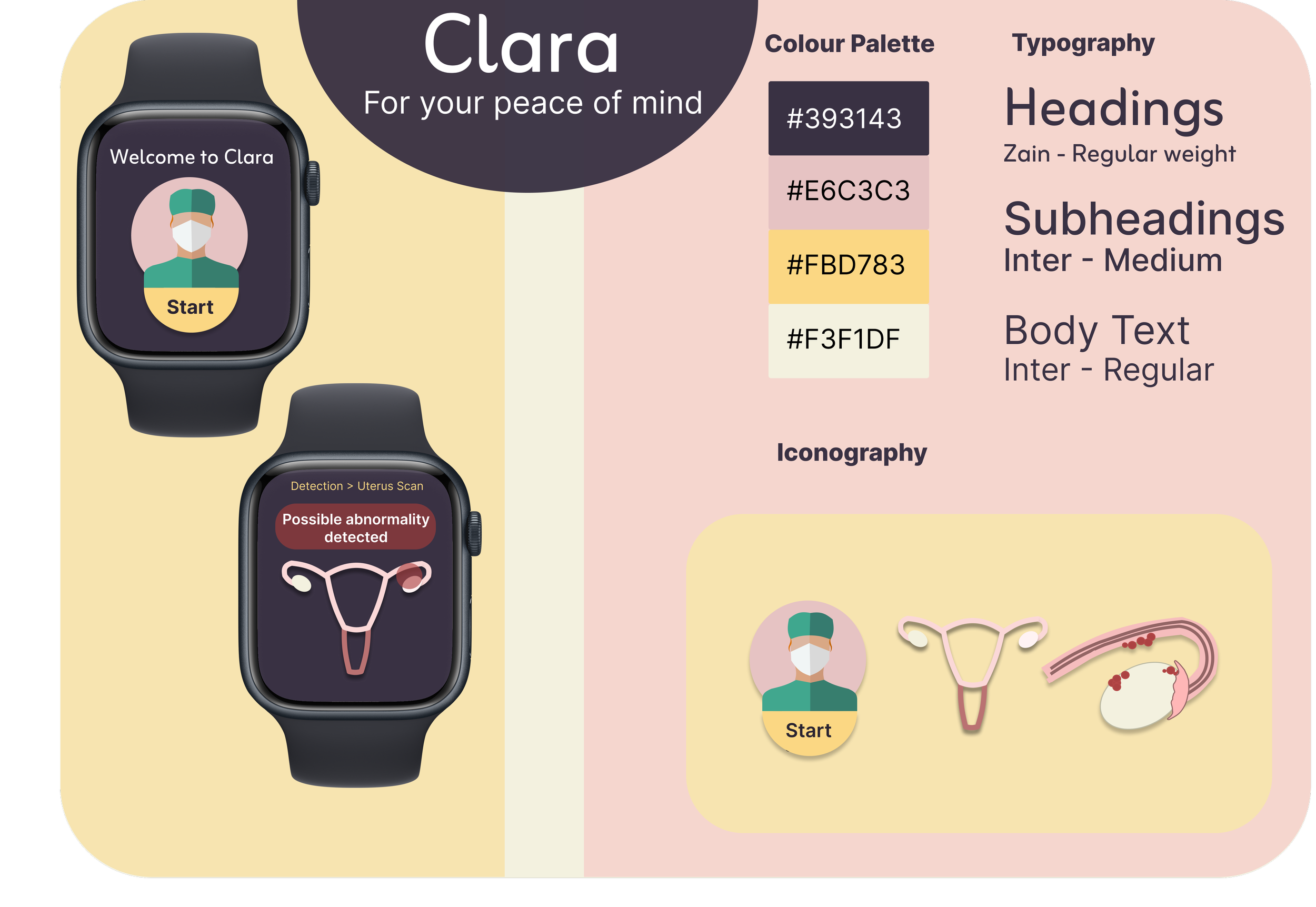
I created a mini style guide as a deliverable to ensure consistency when reiterating and applying user feedback to the project. Reflection
Pro’s and Con’s from my perspective

Overall I believe my design is relevant and provides a user centred solution for common issues for women today. Providing a modern, minimalist aesthetic whilst adhering to WCAG accessibility guidelines (AAA). Core functionality is well communicated although expanding screen would allow for a stronger user journey. I also identified the desire to make more appropriate icons making the app cohesive visually. Explore my project in more depth